A tour of the console
2.4 First run on macOS — granting permissions
The macOS edition (teacher console and student client) is installed into the Applications folder from an installer package (.pkg). The first time it runs, macOS asks for the permissions below. Be sure to grant them: without them, features silently work only by half (for example, only the desktop background is captured, with no error window).
| Permission | What it is needed for | Where to grant it |
|---|---|---|
| Screen recording | Teacher: screen sharing (desktop share and sample broadcast) · Student: thumbnails and full view | System Settings → Privacy & Security → Screen & System Audio Recording |
| Accessibility | Student: remote control (passing on keyboard and mouse input) | System Settings → Privacy & Security → Accessibility |
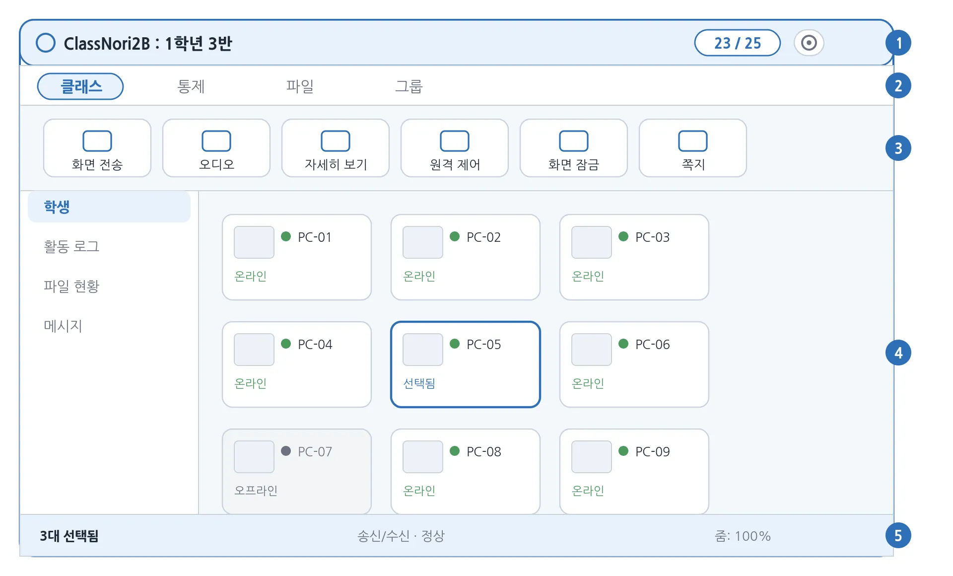
The teacher console divides into five areas, from top to bottom.
| Area | Contents |
|---|---|
| ① Title bar | The app name and the current class name, with the Lock all button (it changes to Unlock all when any student is locked), the connection badge and the settings (gear) button on the right. |
| ② Ribbon tabs | Four tabs that group the features: Class · Materials · Control · Manage. |
| ③ Ribbon buttons | The row of feature buttons belonging to the selected tab. |
| ④ Main area | The left sidebar (students / activity log / file status / messages) and the student grid in the middle. |
| ⑤ Status bar | Send and receive status, and the view zoom level. |
Status strip — the single row between the ribbon buttons (③) and the student grid. The target chip on the left shows who a ribbon button will apply to (chapter 4), and the control chips on the right show, one by one, what is in force right now (internet restrictions, program restrictions, USB, webcam, printer, mute, lock, screen sharing, sample broadcast). Pressing the × on a chip releases it at once, with no confirmation dialog — internet restrictions, program restrictions and locks are released for the whole class, regardless of the team you are viewing or your selection, while a sample broadcast ends only for that team. When there are too many chips to fit on one row, a +N appears at the end; press it to see the rest. A restriction with a time limit also shows the minutes remaining on its chip.
3.1 The student grid and view modes
Student cards are laid out in a grid in the middle. You can switch between three view modes at the top right of the screen.
| View mode | Description |
|---|---|
| Icon | Small cards — good for taking in a lot of students at once. |
| Thumbnail | Large cards with a live preview of each student’s screen — for watching what students are doing. |
| List | One student per row — a calm, table-like view of names and status. |
3.2 What you can do with a student card
| Action | Result |
|---|---|
| Click | Selects or deselects that student (several can be selected). |
| Double-click | Opens that student’s screen in a large window (the same as “Full view”). |
| Right-click | Opens the menu for that student straight away (lock, message, files, power and so on). |
| Drag | Rearranges the cards into an order that suits you. |
| Right-click → Rename computer | Changes the Windows computer name of that student PC remotely and reboots it (see 8.3). The menu item only appears on PCs where this is possible. |
3.3 Card colours and badges
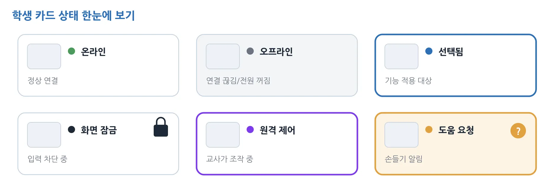
The card border and its badges tell you each student’s current state.
| Indicator | Meaning |
|---|---|
| Bright card | Online — connected normally |
| Dimmed card | Offline — disconnected or powered off |
| Blue border | Currently selected (the target of the next feature) |
| Padlock badge | Screen is locked |
| Purple border | Remote control in progress |
| Raise-hand toast | The student asked for help — “(name) has asked for help” |